AWC is a macOS application for drawing circular maps from numeric data. The latest version is available at the App Store.
Usually, drawing tools use their built-in algorithms to draw a circular map. The input to the software is genomic data files, and the output is circular maps. The kinds of drawing are restrained by the algorithms that they implement.
AWC is designed to accept numeric data that users have prepared, possibly by using their own algorithms.
In addition, AWC produces numeric data to draw:
The graphics created by AWC are in the PDF format and allows you to examine the graphics for analytical purposes (often genomic circular maps are for presentations alone.)
This tutorial will help you understand the basic usage of ArcWithColor. For more details refer to the instruction manual.
Download the genomic data files in the GenBank format.
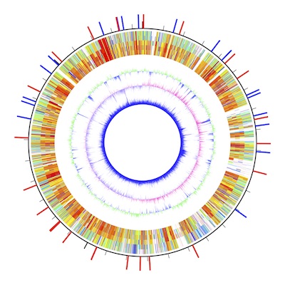
In this tutorial, a graphic representing the largest chromosome of a bacterial strain Burkholderia multivorans ATCC 17616 will be drawn. In the Data Setting window, set "3448421" in the "replicon size" text field for the size of the chromosome. Also, set a value of 350 for the half width of the result display (radius of a circle that fits to the display).

Let's use the DataGenerator of AWC. In the Data Generator window, select a main sequence file ("BmChr1.gb") and select target files (four files in the J2315 folder). To compare the main sequences with the target sequence by blastn, click the run blastn button, and wait for several seconds.

Comma-separated file paths are displayed in the text field.
Now the result is in the pasteboard of your Mac (If not, "copy data to pasteboard" check box is unchecked. Copy the content of the text field below). Open the Data Setting window. In the Data Setting window, there are left and right boxes for two data types (data type I and II).
Data type I is for drawing arcs, whose center is at the midst point of the result display window, whilst data type II is for drawing a segment of a line, which contains the center.
This time, the left box for data type I will be used. Now, paste the data to the second left text field, and set a value of 300 for radius and a value of 10 for width.

The second left text field exhibits only a single row of the huge data.
As you press the return key (or select other GUI components), the data field will be hidden. If you delete the value of either one of two values (300 or 10), the data field will be shown again (this setup is for performance reasons). Set a string value of "J2315" to the left-most text field. This field is just to remember the specification of that data (you may leave this field empty). Now click the draw button or press Command + D to see the graphic. Change the two values to see the outcome.

In the result display arcs are shown. The radius is 300 pt and the width is 10 pt.
You can compare the main sequence with other target sequences (here, files in G4 folder). In the Data Setting window, press the "add new data" button, to add a new row, and fill the textfileds as described above. Like this, the blastn result are turned into a graphic!
The canonical type I data format contains multiple rows; each row contains three values for "start location," "end location," and "color key," and a tab character separates these values. For example,
100000 200000 red
means to draw a red arc starting from 100 kb to 200 kb. The radius and width of the arc are set in the Data Setting window.
You can see the accepted data format by pasting them to a spreadsheet. There are three values, i.e., start location, end location, and a color key. A color key with a prefix of "AWC/" is a special color key, for which the subsequent numeric value is used to find a corresponding color in a color scale (AWC/91.148 indicates a color at position 91.148 in the color scale).

blastn results pasted into a spreadsheet.

To add GC-content data to the graphic, press the GC-content button in the Data Generator window, and paste the result data in the second left text field in the right box of the Data Setting window, and set a value of 250 for radius, and a value of 0.5 for width.
Fill the leftmost text field with "GC-content" to remember that this row is for the GC-content. Draw the graphic by command + D.


Try to use a different color schale by selecting one in the pull-down menu.

Some data generator functions use specific color keys. They are "LowerThanThreshold", "HigherThanThreshold", "LowerThanZero", "HigherThanZero", and "ColorForBias". Try to change the associated colors in the Color Setting window.
Also try to use different data generation functions with different parameter settings. This file contains Type I and Type II data for drawing, which are related to the test data file (BmChr1.gb).
Another App named GenomeMatcher is bundled with an accessory tool named "GeneDrawer."
Unlike AWC that draws circular maps, GeneDrawer is for drawing linear maps.
I would appreciate your sending me bug reports.
Yoshiyuki Ohtsubo Ph.D..
yoshiyuki.ohtsubo.a6[at]tohoku.ac.jp
Please cite the GenomeMatcher Project.
Y. Ohtsubo, W. Ikeda-Ohtsubo, Y. Nagata and M. Tsuda: GenomeMatcher: a graphical user interface for DNA sequence comparison. BMC Bioinformatics 9: 376 (2008)
I would appreciate your considerations of the donation to my laboratory. Now I am trying to develop a rapid detection system for the new coronavirus, SARS-CoV-2. My challenges are to develop a means to detect SARS-CoV-2 within two minutes. I have already obtained a pool of DNA aptamers that binds to the receptor-binding domain of the spike protein (S-RBD). However, I have been facing difficulties in getting found for further development. The donation will be used for the development as well as to support software engineering, and to conduct research and educational activities in my laboratory.
Please fill the donation application form and e-mail it to our accounting office: lif-kaik"at"grp.tohoku.ac.jp
 大学改革の方針転換を。「REUP提案」をお読みください。
 入試や就活で「推し研」を問いませんか?
 本書では、科学的素養を7項目で整理・明文化しています。教育の質、学びの質を高め、研究力向上を。
 本書では、研究力低迷問題を分析し、解決策を提案しています。研究、教育に携わる多くの方にお読みいただけますと幸いです。解説資料平易版 ・提案資料
 QRコードをスマホで読み取って出席登録。出席管理WEBシステムです。
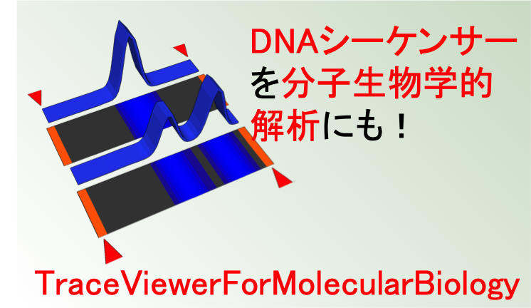 TraceViewer。変性ポリアクリルアミドゲル電気泳動の代わりにシーケンサーでデータを取りませんか?macOSアプリです。
 ShortReadManager NGSデータの処理に便利なmacOSアプリです。変なアイコンですみません。
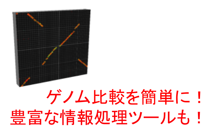 GenomeMatcher ゲノム比較機能をはじめ色々な情報処理ツールがついています。数値データをグラフィックスに変換する機能も。
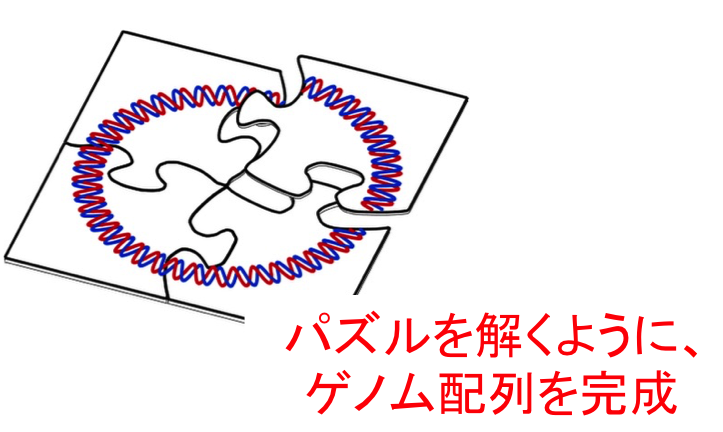 GenoFinisher バクテリアゲノムをshort readだけでも決定可能です。バクテリアゲノムのフィニッシングでお困りの方はご相談ください。
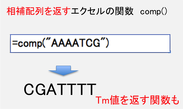 DNA配列の相補配列を計算する関数を含むエクセルシートです。
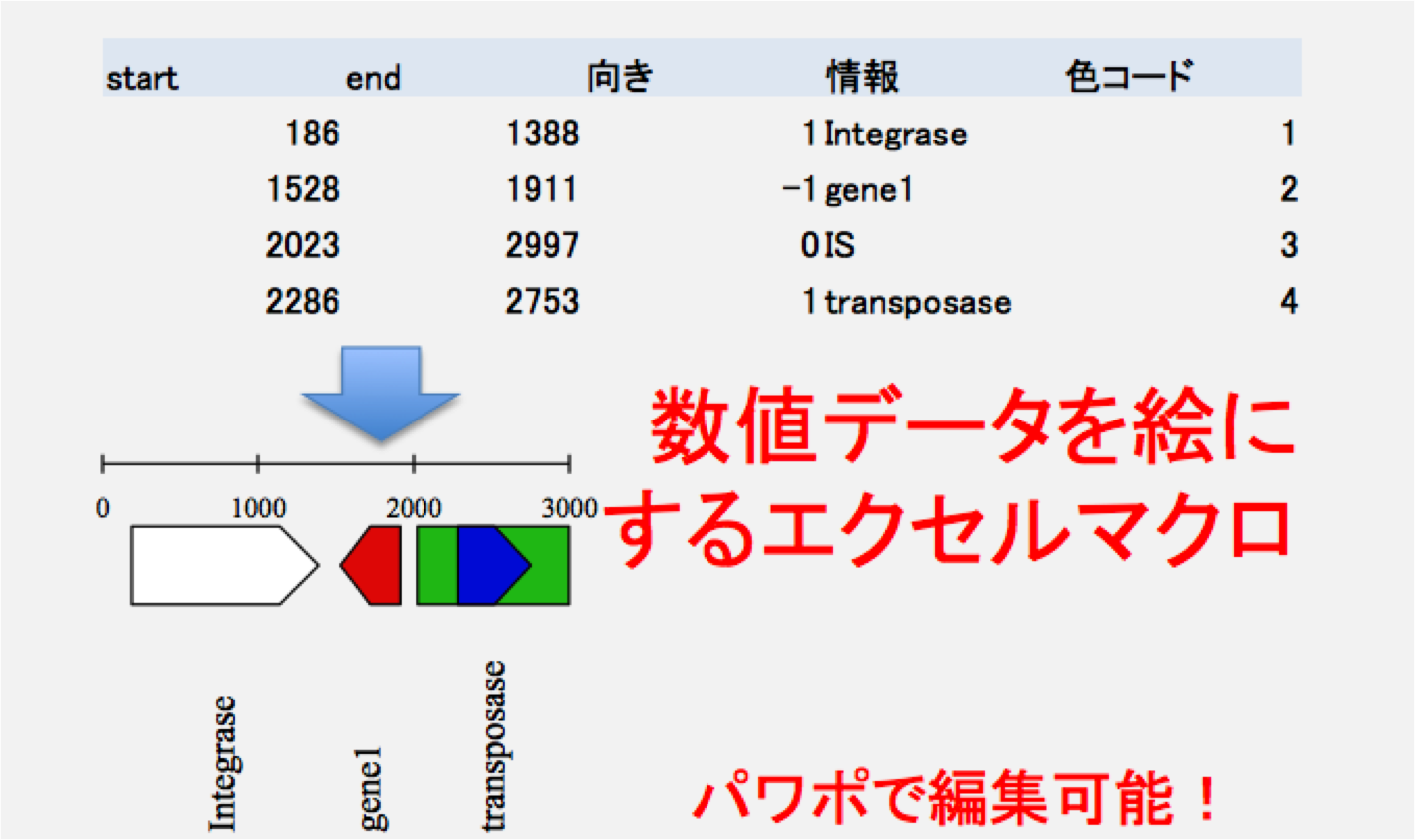 数値データを絵に変換するマクロを含むエクセルシートです。
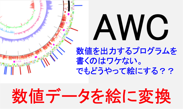 数値データを元にサーキュラーマップが描けます。データ生成機能もあります。
 大学等研究機関での実験機器類の共用を促進するためのウエブシステムです。
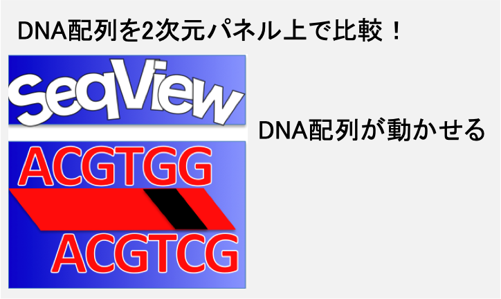 DNA配列/アミノ酸配列を2次元パネルの上で動かせるソフトウエアです。配列比較も。
 例の処理を簡単に済ませるあのツールです。
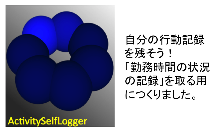 iPhoneアプリです。勤務地への入域と出域時刻のログを自動的にとります。App Storeから入手できます。
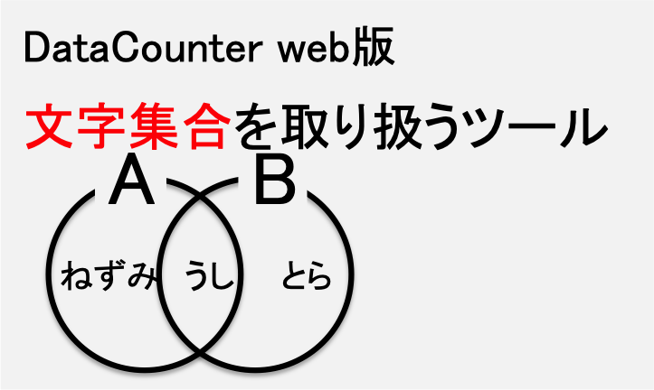 文字列集合を取り扱える便利ツールです。
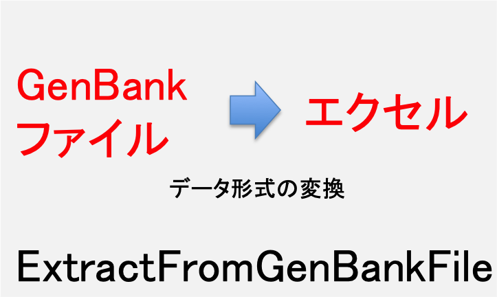 GenBankファイルのデータを、エクセルシートで取り扱えるように変換するツールです。
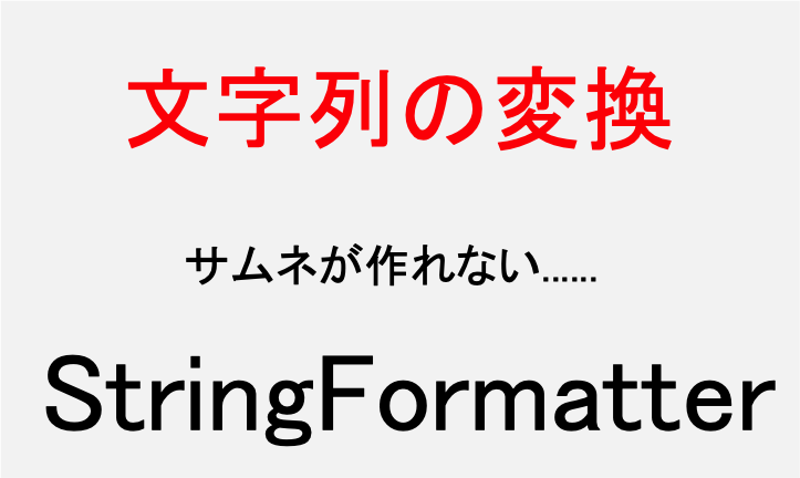 文字列を取り扱える便利ツールです。
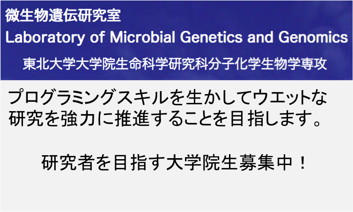 作者研究室ホームページ。共同研究の提案と研究室への寄付を歓迎します。
作者プロフィール: 環境細菌の研究を進める一方で、様々なソフトウエアを作成、公開している。